At Agency of None, we recently had the pleasure of collaborating with Mirno to create a visual identity system that would not only reflect Mirno's innovative spirit but also convey the essential elements of their mission. In this blog post, we will walk you through some of our design process and the key decisions that shaped the final outputs of Mirno's identity system and website.

Word Mark: Simplicity with a Medical Twist
We aimed for a word mark that was clean, simple, and subtly evocative of the medical field. Drawing inspiration from the graphs and readouts that are ubiquitous in emergency rooms, we crafted the curves of the 'M' and the shape of the 'N' to mirror the forms found in monitoring equipment. This nod to the medical industry was intentional yet understated, creating a balance between professional relevance and modern simplicity. The logo was designed on a simple grid, which became the foundation for the supporting graphical elements used throughout the system.
Brand Mark: Connection and Space
The brand mark for Mirno is a multi-faceted symbol. The 'M' can be interpreted as two people holding hands, a poignant reference to the many moments of comfort shared between parents and children in emergency rooms. This element of human connection is central to Mirno's mission of creating a supportive training environment for paediatric clinicians.
Additionally, space is a core concept in Mirno's offering. Their technology provides a virtual space for clinicians to train, available whenever they need it. We embedded this idea of space into the identity system, creating a brand mark that gives an illusion of either protruding or being recessed, depending on the viewer's perspective. This visual ambiguity echoes the innovative and flexible nature of Mirno's virtual training environment.

Colour Palette: High Contrast for High Pressure
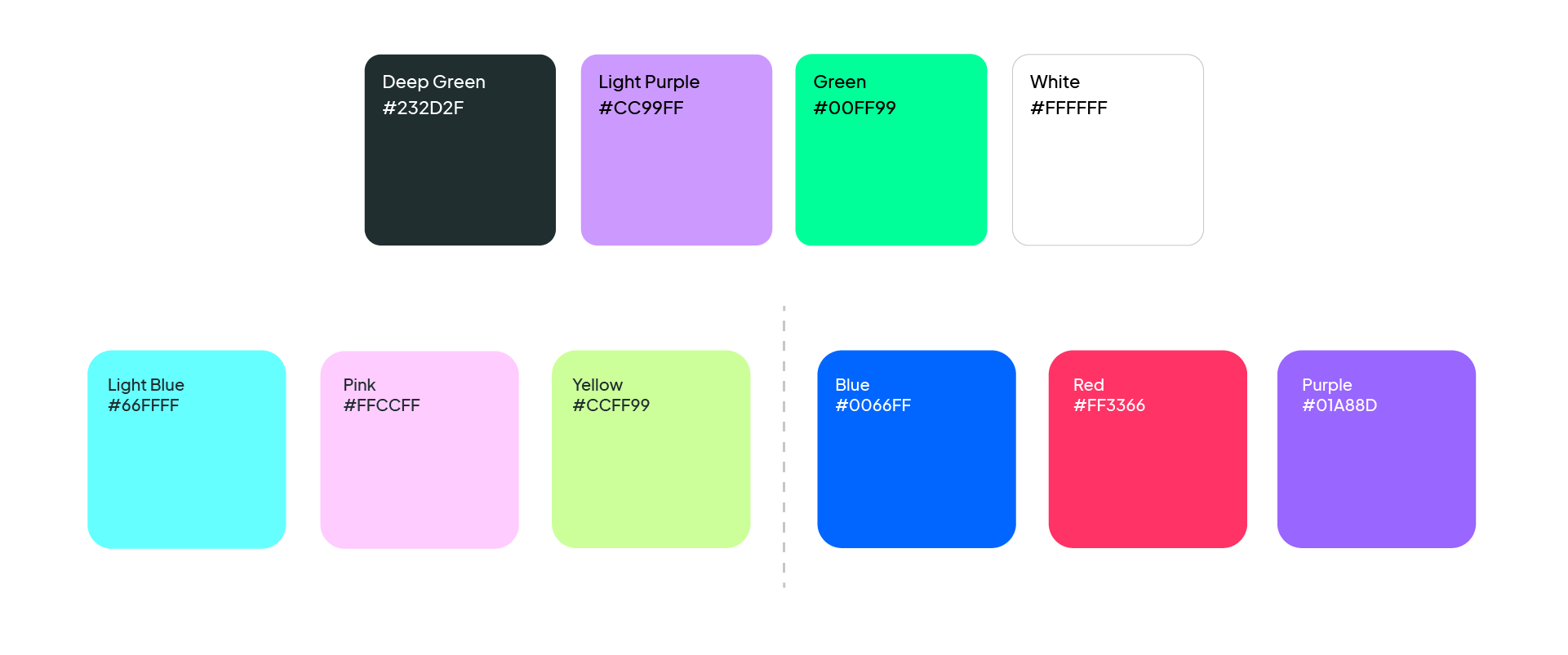
Starting with the colours of hospital scrubs, we developed a unique palette for Mirno that emphasises high contrast. This decision was driven by the high-pressure situations in which Mirno's technology is used, where clarity and focus are paramount. The vibrant and contrasting colours not only draw attention but also symbolise the critical and dynamic environment of paediatric healthcare.


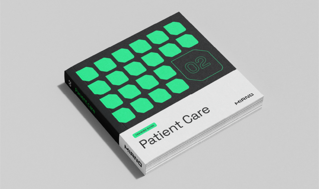
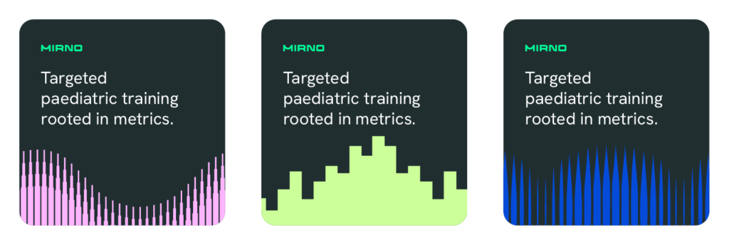
Pattern: Distinctive and Impactful
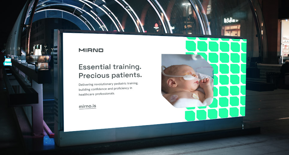
The patterns we created for Mirno were derived from gauze textures, medical graphs and block patterns representing space. Each pattern was designed to be distinctive and offer bold usage, ensuring a memorable and impactful visual identity. These patterns serve to reinforce the technological and medical aspects of Mirno's brand while providing a visually engaging experience.
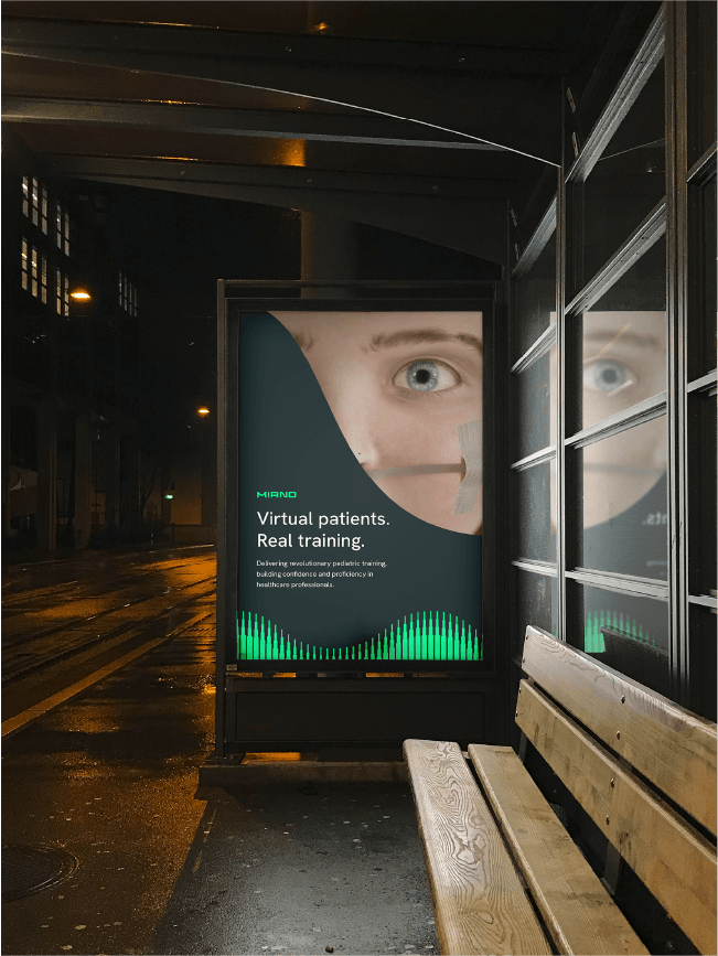
Imagery: Harmonizing Reality and Graphics
Mirno's technology creates incredibly lifelike virtual patients, making training scenarios feel authentic. It was crucial for us to find a way to seamlessly integrate these 3D renders with the graphical elements of the brand. The result is a coherent and harmonious system that maintains flexibility for various applications. This integration ensures that the imagery supports the brand's narrative and enhances the overall identity.
Conclusion
Our collaboration with Mirno was a real creative journey. By thoroughly understanding their mission and the unique challenges they address, we were able to develop a brand identity system that is not only visually appealing, but also deeply connected to the core values of the company. At Agency of None, we are proud of the work we've done with Mirno and look forward to seeing how their new brand identity helps them continue to revolutionise paediatric clinician training.